How to Blend and Shade with Colored Pencils: A Beginner’s Guide
Colored pencils are great for more than just coloring in a shape with one solid color.
With a few easy tricks, kids and beginners can make smooth color changes, gentle shadows, bright highlights, and fun textures. For example, a red apple can look round, a flower petal can fade from dark to light pink, and a sky can go from deep blue to pale blue near the horizon.
The best part is you do not need fancy art supplies to blend and shade. All you need is a basic set of colored pencils, some good paper, and a bit of patience.
Start With Less Pressure Than You Think
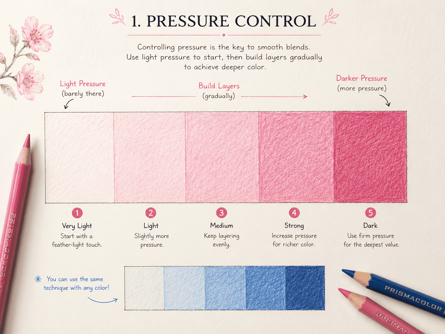
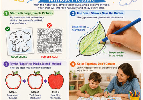
The most common beginner mistake is pressing too hard on the first layer.
Pressing too hard fills up the paper fast, so it is hard to add more color later. It can also make shiny spots that are tough to blend.
Instead, hold your pencil in a way that feels comfortable and start with a light layer of color. You should still see some of the paper showing through. Add more layers slowly until the color looks as dark as you want.
Try to think of coloring as building up color little by little, not putting it all down at once.
A useful practice exercise is to draw a long rectangle and divide it into five sections. Use the same pencil across the entire shape, beginning with very light pressure and making each section slightly darker.
This shows that you can get different shades from just one pencil, depending on how hard you press.
Children who are still learning to control their pencils may benefit from starting with larger coloring areas. The guide How to Choose the Right Coloring Pages for Your Child’s Age explains how to select designs that match a child’s current ability.
The Three-Layer Blending Method
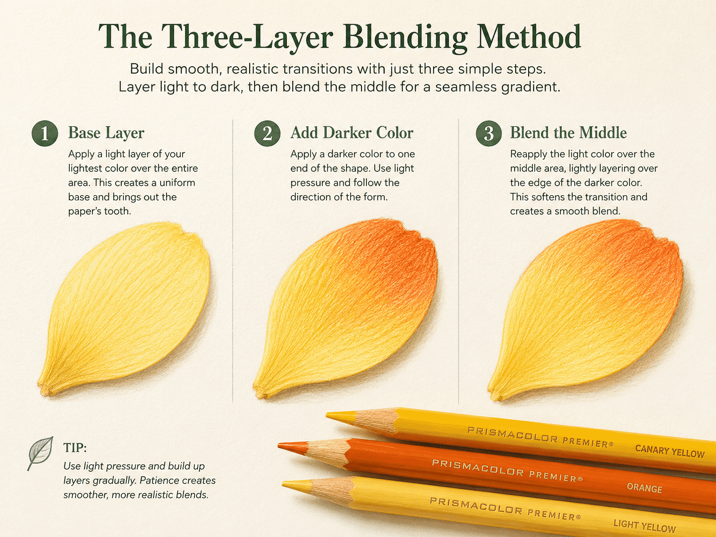
An easy way to blend two colored pencils is to work in three layers.
Imagine coloring a flower petal with yellow and orange.
First, cover the whole petal with a light yellow layer. Keep the strokes gentle and move in the same general direction.
Next, add orange near the base of the petal. Use slightly more pressure where you want the color to appear darkest, then gradually reduce the pressure as you move toward the yellow area.
Finally, go over the middle section again with yellow. This helps soften the transition between the two colors.
Your blending does not have to look perfectly smooth. Colored pencils often leave some texture, especially if you use regular printer paper.
Try combinations such as:
- Yellow and orange
- Light blue and dark blue
- Pink and purple
- Light green and dark green
- Red and brown
Colors that sit close together often blend more easily than those that are completely opposite.
A basic set of good colored pencils is usually enough. If you are deciding between pencils, crayons, and markers, see Crayons vs. Colored Pencils vs. Markers for a practical comparison.
Use Small Circles for Smoother Color
Long, straight strokes can leave lines you can see, especially when you change the direction of your pencil.
To make the color look smoother, move your pencil in small, overlapping circles. Keep your circles loose and do not press too hard.
This technique works well for:
- Skies
- Animal fur
- Flower petals
- Faces
- Round fruit
- Large background areas
Another option is to use short strokes that follow the object's shape.
For example, curved strokes can make an apple appear round. Long strokes following the direction of an animal’s body can suggest fur. Lines moving outward from the center of a flower can make the petals feel more natural.
The way you move your pencil is almost as important as the color you pick.
How to Add Simple Shading
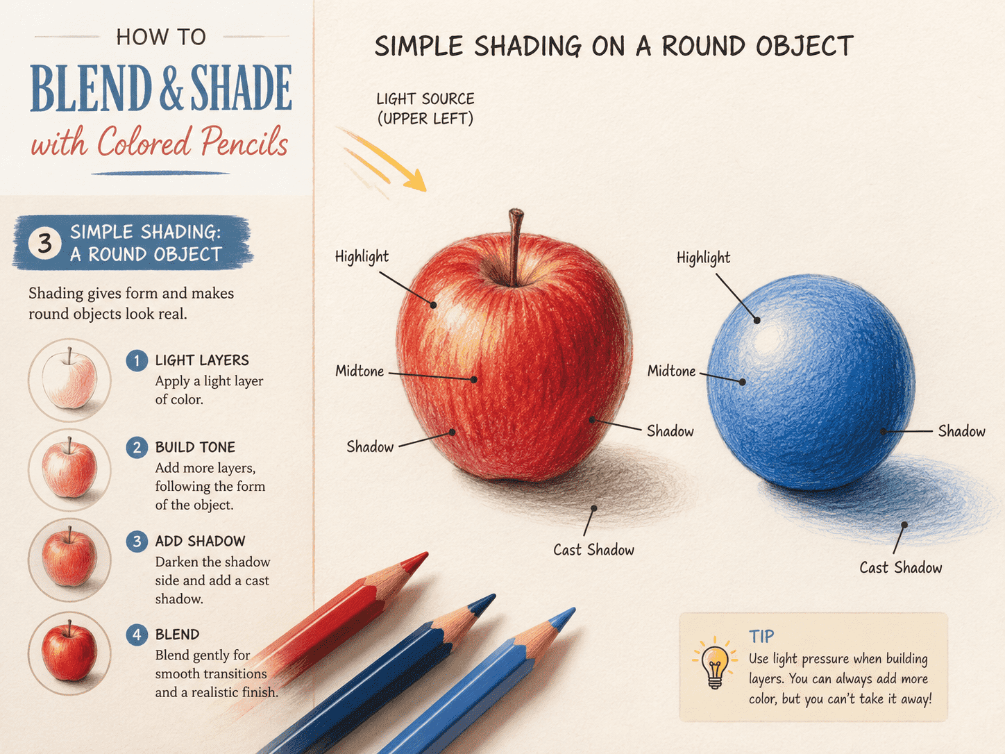
Shading means making one part of an object darker to suggest depth, shape, or light.
Before coloring, imagine where the light is coming from. It might come from the upper-left corner of the page, from the sun, or from a lamp inside the picture.
The part of the object closest to the light should stay lighter, and the other side can be darker.
For a simple ball:
- Leave a small light area near the top.
- Use a medium shade across most of the ball.
- Add a darker shade near the bottom and one side.
- Blend the areas with a lighter pencil.
For an apple, add darker red near the bottom, around the stem, and along the side opposite the light. Leave a small uncolored or lightly colored highlight to make the surface look slightly shiny.
You do not always need a darker version of the same color. Try adding:
- Dark blue over light blue
- Brown over red
- Purple over pink
- Dark green over yellow-green
- Gray over blue
Use these darker colors gently. You usually only need a little bit.
Try Layering Different Colors
Blending is not limited to two similar pencils.
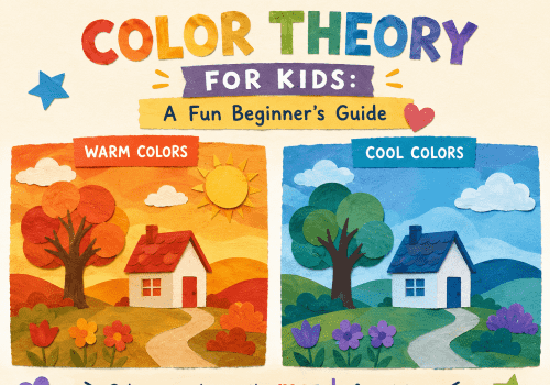
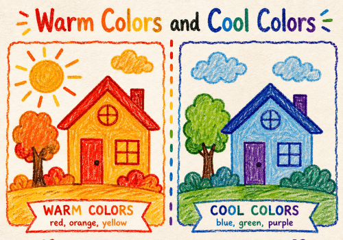
Layering unexpected colors can create richer results. A blue layer under green can make leaves feel cooler. Yellow beneath red can create a warmer orange-red. Light purple over blue can make a sky feel softer.
Test combinations on a spare sheet before using them on the final page.
Create a small color chart by drawing squares and labeling each pencil used. For example:
Yellow + Red
Blue + Green
Pink + Purple
This makes it easier to remember successful combinations later.
A spare testing sheet is also useful when making a homemade activity book. The process in Turn Your Ideas into a Personalized Coloring Book includes ideas for adding a dedicated color-testing page.
Blend With a Light Pencil
A white or very pale pencil can help soften visible lines.
After applying two colors, gently go over the transition area with white, cream, pale yellow, or another light shade. This can press the pigment into the paper, making the colors look more connected.
Keep in mind that using a white pencil can make your colors look lighter or a bit cloudy.
Another method is to use the lightest color already present in the picture. For a blue gradient, apply dark blue first, add medium blue, then blend with light blue.
Try not to use your fingers to smudge the color. The oils from your skin can leave marks, and colored pencils usually do not blend well this way.
Paper Changes the Result
Smooth paper makes it easier to create even color and fine details. Textured paper leaves more visible white gaps and produces a grainier effect.
Regular printer paper works for practice, but thicker paper, like 90-120 gsm, often gives better results. It can handle more layers without wrinkling as much.
More detailed recommendations for papers are available in The Best Paper for Printing Coloring Pages at Home.
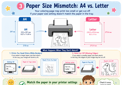
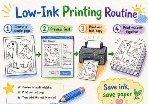
When printing a page for blending practice, choose a clear image with medium or large spaces. Extremely small sections make it difficult to experiment with gradual color changes. The printing guide How to Print Coloring Pages at Home explains how to enlarge pictures without cutting off the edges.
A Five-Minute Practice Exercise
Draw or print three simple shapes: a circle, a leaf, and a heart.
Color the circle with one pencil, beginning lightly at the top and becoming darker toward the bottom.
Blend yellow and green across the leaf, keeping yellow near the center and darker green around the edges.
Use pink and purple on the heart, placing purple along one side and gently blending it into pink.
This quick exercise helps you practice pressure, layering, blending, and shading all at once.
Do not worry if you see pencil lines the first time you try. Blending gets better with practice, and sometimes the texture can make your art look unique.
Final Thoughts
Great colored-pencil shading comes from using light pressure, adding layers, and making slow changes—not from pressing really hard.
Start with a light base color, add darker shades little by little, and use your lightest pencil to blend the edges. Try to follow the shape of what you are coloring, and leave small highlights where the light would hit.
You do not have to make every drawing look real. These tips just help kids and beginners try new things with color and make each page feel special.